
Average response time has become the default metric on many dashboards. It's easy to compute, easy to explain, and provides a single number to track over time. Of all the metrics available in application monitoring, this one feels closest to the actual user experience.
But this simplicity can create a trap if you treat the average as a complete picture of system health. In fact, it’s really the starting point for a deeper investigation.
What average response time shows well
In essence, average response time excels at revealing trends, like these:
- For systems with relatively uniform request patterns, the average provides a reasonable health baseline.
- When average response time drifts upward over days or weeks, something in your system is changing. (Gradual data growth, accumulating technical debt, or slowly degrading infrastructure.)
- Averages also work well for detecting regressions. If a deploy causes your average response time to jump, that's a clear signal worth investigating.
What average response time does not show
However, averages can hide information and obscure user experiences that are fundamentally different.
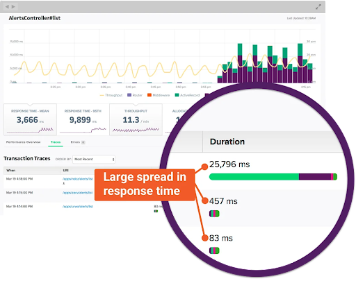
If 5% of your users wait 10 times longer than everyone else, that's a big problem. But when those get averaged with thousands of fast ones, this metric (which is called tail latency) vanishes. You’ll know you need to investigate but you may not have a clear direction.
- How long did the slowest requests take?
- Was the system under an unusual load?
- Where did requests spend their time waiting?
Answering these questions requires correlating response time with other metrics – let’s look at some of the most useful.
Correlating average response time with percentiles
Percentiles describe response time distribution by showing where specific fractions of requests fall. The p95, for instance, represents the threshold below which 95% of requests complete.
When the average and p95 move together, the entire distribution shifts. Thus, a deployment that raises both metrics proportionally suggests a uniform slowdown affecting all requests. (This typically points to changes in processing logic or infrastructure capacity that impact everything equally.)
When the p95 rises while the average holds steady, you have a tail latency problem. Something is making a fraction of requests much slower without affecting the majority.

Common causes include lock contention under specific conditions, garbage collection pauses, or timeouts to a degraded dependency.
When the average rises while the p95 stays flat, you're likely seeing a shift in request mix. Perhaps a higher proportion of requests now hit a slower code path, or a segment of traffic shifted from cached to uncached responses.
✅ To sum up, tracking both these metrics together prevents performance misinterpretation.
Read Scout’s full post on percentiles here.
Correlating average response time with throughput
Throughput measures the volume of requests your system handles over time, typically expressed as requests per second or requests per minute.
In a healthy system, response time remains stable as throughput increases, up to a point. This indicates sufficient capacity to absorb load. When you see throughput climb while the average stays flat, your system is handling growth without strain.
When response time rises in proportion to throughput, you're approaching capacity limits. The system can still process requests, but contention for resources, whether CPU, database connections, or downstream services, introduces delays. This is your signal to investigate scaling options before performance degrades.
A more concerning pattern emerges when response time rises while throughput drops. This suggests the system is struggling to complete work, possibly due to an external dependency timeout, a saturated resource, or a failure mode that's causing retries.
✅ Watching these two metrics together reveals whether slowness is demand-driven or infrastructure-driven.
Read Scout’s full post on throughput here.
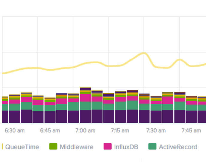
Correlating average response time with queue time
Queue time measures how long requests wait before processing begins. This includes time in network buffers, load balancer queues, and application server request queues.
The relationship between queue time and response time is causal: when response time rises, checking queue time first reveals whether requests are waiting longer to start or taking longer to complete once they start.
- Rising queue time with stable processing time indicates capacity exhaustion. Your system can execute work at normal speed but can't start that work quickly enough. Adding capacity or reducing concurrency often resolves this pattern.
- Stable queue time with rising response time points to processing slowness. Requests start promptly but take longer to complete. This pattern directs investigation toward application logic, database queries, or downstream services rather than capacity.
Read Scout’s full post on queue time here.
✅ Queue time often rises before response time becomes obviously degraded. Watching it lets you address capacity problems before users notice significant slowness.
Correlating metrics is a monitoring essential
Taken alone, average response time tells you that something is happening. But this metric really becomes meaningful through correlation:
- Combined with percentiles, it reveals whether problems affect all requests or just a subset.
- Combined with throughput, it distinguishes load-driven slowness from systemic degradation.
- Combined with queue time, it separates waiting problems from processing problems.
A dashboard that shows response time without context invites misinterpretation – but by using one can easily correlate these four metrics, you’ll be able to guide your investigation toward root causes. Start your free 14-day trial of Scout Monitoring!