
Throughput is one of the most foundational metrics in application performance monitoring. It tells you how many requests your app is handling over time and offers a direct look at system load, responsiveness, and scalability.
But throughput rarely speaks for itself. The key is knowing how to interpret it, and when to act.
In this post, we’ll look at how throughput works in the real world: what healthy looks like, what broken looks like, and what lives in between.
The value is in the correlation
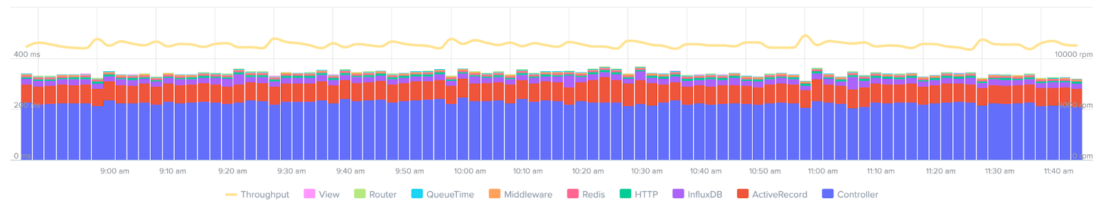
Throughput is most meaningful when you pair it with other data—response times, deploy history, external metrics, even analytics. You don’t get much from raw throughput alone. But when you combine with these sources, you can understand what’s really happening.
For instance:
- A sudden throughput spike might look bad (but maybe it aligns with a successful marketing campaign or a known batch job).
- A drop might mean failure (but it could just be a deploy that introduced more efficient data fetching by the front-end).
Scout shows throughput clearly, but the real value is how it connects with other data: trace views, error rates, infrastructure usage, and more.
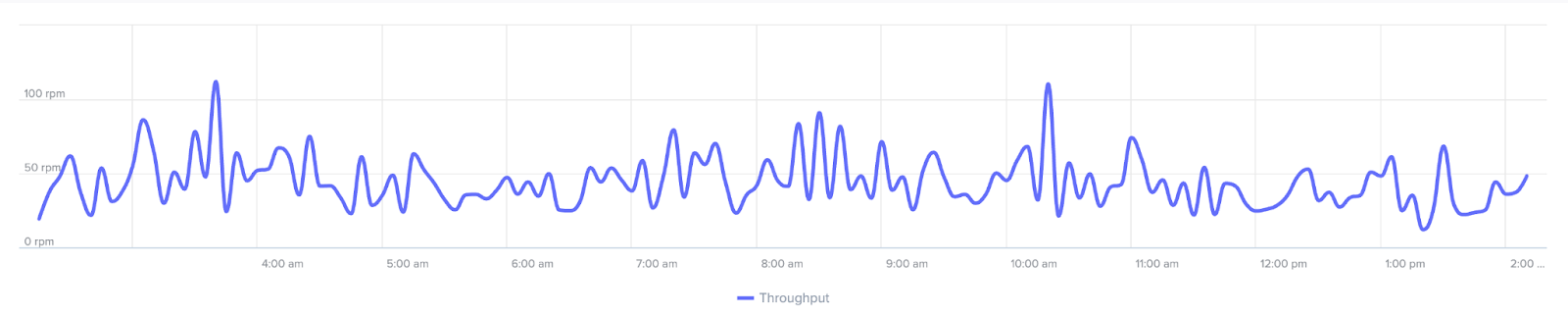
🟢 What does “healthy” look like?
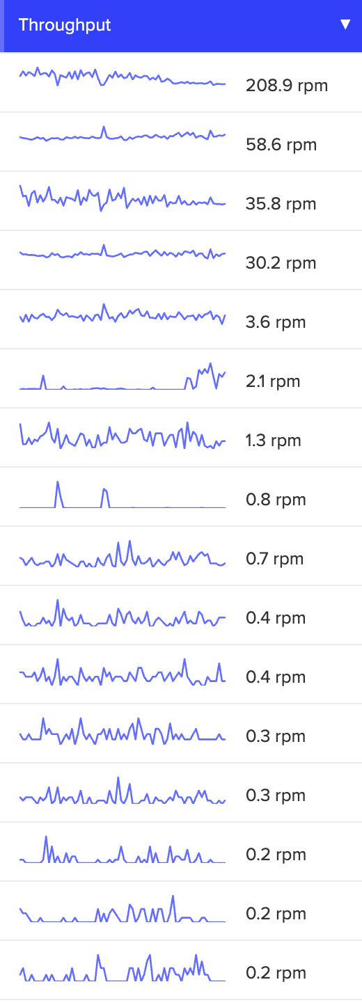
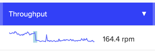
Throughput patterns in a healthy application may not always look identical, but they’re predictable. One endpoint might spike every five minutes because of a monitoring job. Another might see a daytime traffic arc. Scout makes this easy to visualize with spark lines and mini-charts across endpoints.
As long as these patterns are consistent and response times stay low, there’s little to worry about. This is your baseline, and once you know the normal arc, any deviation stands out immediately in Scout’s sparklines and endpoint mini-charts.
🤔 When things aren’t broken …but don’t look right
All that said, the in-between cases are where things get tricky. Here are a few common patterns that look strange at first glance, but don’t always mean something’s wrong.
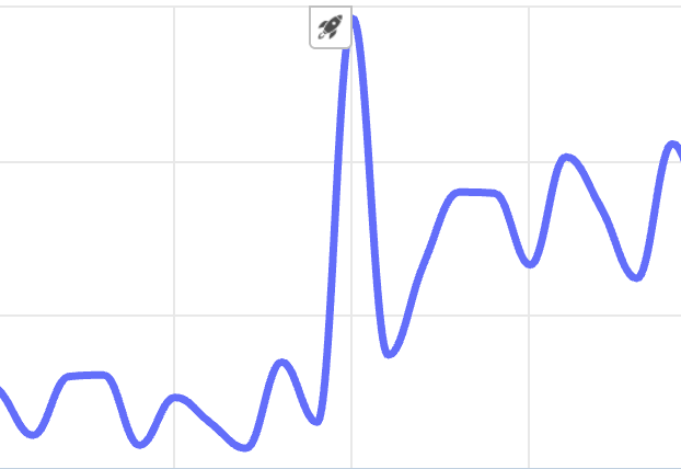
1. You “DoSed” yourself
Say you roll out a new feature in a single-page app, and each page load now triggers 30+ requests due to inefficient frontend logic. Throughput spikes! But it’s not because you gained users. Rather, you just wrote code that’s hammering your own servers. Scout helps you correlate that spike with your deploy so you can track it down.
2. Known activity with a known cause
You might see a nightly spike that aligns with load testing. Perhaps a Black Friday sale pushes traffic higher. These events show up in throughput, but don’t represent app problems. They’re expected. The key is knowing when to expect them, so you don’t overreact.
3. Quiet failures
Sometimes throughput drops, and no one notices right away. One possible reason? A newly deployed feature slowed down something shared across endpoints (like a database call or a middleware service).
The throughput chart looks familiar in shape, just slightly lower across the board. That’s often a signal that something deep in the stack is now slower. In Scout, comparing endpoints side-by-side can reveal this kind of pattern quickly.
🟡 Moderate trouble: something’s off
This is where throughput becomes a real diagnostic tool.
4. Isolated slowdowns
You roll out a feature. Most endpoints look fine …but one drops to 10% of its previous traffic. That usually means you’ve broken a code path.
Scout’s trace explorer can help you pinpoint what’s failing and why, especially if error rates or response times jump alongside the drop.
5. Dependency pain
Sometimes the culprit is a third-party API or service. A slow external database, for instance, might cause requests to pile up or timeout. Throughput drops, but the root cause lives in a dependency you don’t control.
These scenarios show up clearly in Scout when multiple endpoints simultaneously experience elevated latency or error rates tied to external calls.
🚨 Critical failures: when to sound the alarm
6. Major drop during peak hours
If throughput plummets while traffic should be high, it’s likely that something serious is wrong. This could be a broken route, a failed deployment, or infrastructure limits silently cutting off traffic.
In Scout, you can set alerts for unusual drops to help catch these issues quickly.
7. Overwhelmed by success?
Sometimes traffic goes viral. Throughput maxes out and it’s not because your app broke. Instead, it simply can’t handle the load. If you haven’t changed anything recently, and user demand is climbing, that’s a sign to consider scaling infrastructure or optimizing code paths. Correlate throughput trends with analytics data or marketing efforts to know for sure.
Key takeaways
- Throughput gains meaning when correlated with response times, error rates, deployments, or analytics.
- Healthy throughput patterns look different across endpoints, but they should be consistent.
- Scout makes it easier to read these patterns and track them to their source.
- Unexpected spikes or drops don’t always mean failure, but they’re worth investigating.
- Not every issue looks like a crash—many begin as subtle slowdowns.
Final thoughts
Scout APM gives you the tools to read and correlate throughput clearly—so you can fix issues before they reach your users, and understand how your app is growing over time. Plus, Scout’s Error Monitoring and MCP Server make understanding your applications health even easier. Start your free trial now.