
Your app feels slow, users complain… but your dashboard says response time is totally fine! But the real pain is revealed when looking at percentiles. In this post, we’ll break down why the 95th percentile response time metric is useful, plus how to work with it in practice.
Mean response time vs. percentiles
Response time measures how long the server takes to respond to a client’s request. A lower response time means that the server is very quick in responding to the user’s request. An endpoint with a higher response time means clients are left waiting longer.
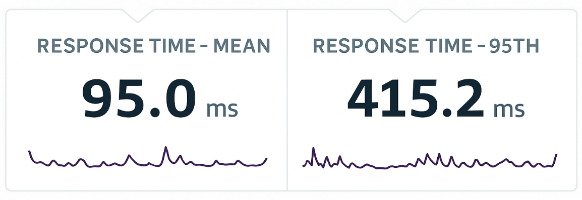
Two of the most common metrics for analyzing response times are mean response time 95th percentile response time.
- Mean response time is the average response time for each request. In general: the lower, the better, but it doesn’t give us the whole picture.
- 95th percentile response time is the amount of time it takes for 95% of the transactions to complete. We want all endpoints to respond ASAP, so the closer this value is to the mean response time, the better.
The problem: this average metric can mask the fairly bad experience that some users are experiencing. However, if we also look at the 95th percentile response time, it will highlight the slowest 5% and point us on the path to identifying and fixing the issue.
At the same time, the 95th percentile response time can be quite illuminating. For instance, let’s imagine your app has 100 requests: 90 load the page in 80ms, while the other 10 take 2.5 seconds each. Looking at the mean response time, you’d see 320ms. That latter number might be acceptable – but those 2.5 second requests are not!
Using percentiles in real life
The distance between these two metrics is called spread, and it tells us how wide the gap is between “most requests” and “the unlucky ones”. A small spread (sometimes called a light tail) means your slowest requests aren’t much slower than your average ones. This is exactly what you want in a healthy system.
In the real world, when we compare average response time to the 95th percentile, what we’re really comparing is typical performance vs. the slowest user experiences.
When the spread grows and the 95th percentile pulls far away from the mean, it’s a sign that a minority of requests are hitting serious delays. That tail behavior is where performance problems hide.
Common causes of high 95th percentile latency:
- Cold caches or first-time loads
- Garbage collection pauses or memory bloat
- Lock contention or DB pool saturation
- Large or variable payloads (e.g. exporting reports, generating PDFs)
- Queueing or thread starvation during traffic bursts
- Uneven load distribution (some instances slower than others)
When you have a big spread at regular intervals, it might indicate a regular background job or database maintenance. If you need to find the answer, there are ways to make it easier, which we’ll tackle later in this post.
Correlating metrics to solve problems
Of course, these metrics are most useful when correlated with other metrics, which thankfully, Scout makes very convenient, and also easy to hone in on specific time periods.
Let’s discuss metrics that commonly come in handy alongside the 95th percentile when diagnosing a performance problem:
Database time is a very important correlating metric when p95 jumps. Even when most requests are fast, slow or blocked queries create long waits for a small fraction of requests. Scout’s component breakdown makes this obvious as the DB block grows. If p95 rises but CPU and throughput look normal, DB time is almost always a culprit.
Throughput is a powerful leading indicator of tail latency issues. A sudden surge in requests can cause worker exhaustion, increased queue time, and sharp p95 spikes, even if average latency barely moves.
Conversely, a sudden drop in throughput often signals external API problems or infrastructure stalls and the app simply isn’t able to serve requests quickly. When p95 and throughput move together, it’s usually a load or resource-capacity issue; when they diverge, something upstream is failing.
Memory usage is a major driver of tail latency because GC pauses hit requests unevenly. A worker might stop the world for 80–300ms during a GC cycle while others continue responding normally. This creates the classic “mean stays flat, p95 spikes periodically” pattern. A growing heap, memory leak, or container nearing its limit also leads to degraded performance that often first appears in the 95th percentile before impacting the mean. Thus, when p95 spikes occur at regular intervals, high memory churn is a prime suspect.
Error rate is a key correlating metric because errors frequently occur because requests were slow. When a p95 spike aligns with an error spike, it usually implicates a dependency: a slow API, DNS issue, or transient infrastructure failure.
Digging deeper
The next step is understanding how to work with these when dealing with real traffic.
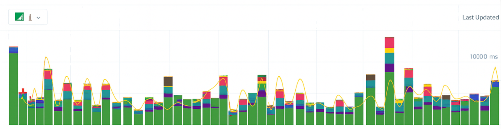
Returning to Scout again, in the above screenshot, we see just a slice of Scout’s UI over a 60 minute period. Each bar shows the time with the colors indicating how much a particular element contributed to overall request time (for example, Redis or ActiveRecord).
And there are a lot of different ways Scout allows us to view and work with these metrics:
Beyond the monitoring dashboard
*Learn more about Scout in the docs and sign up for a free *14 day trial here.
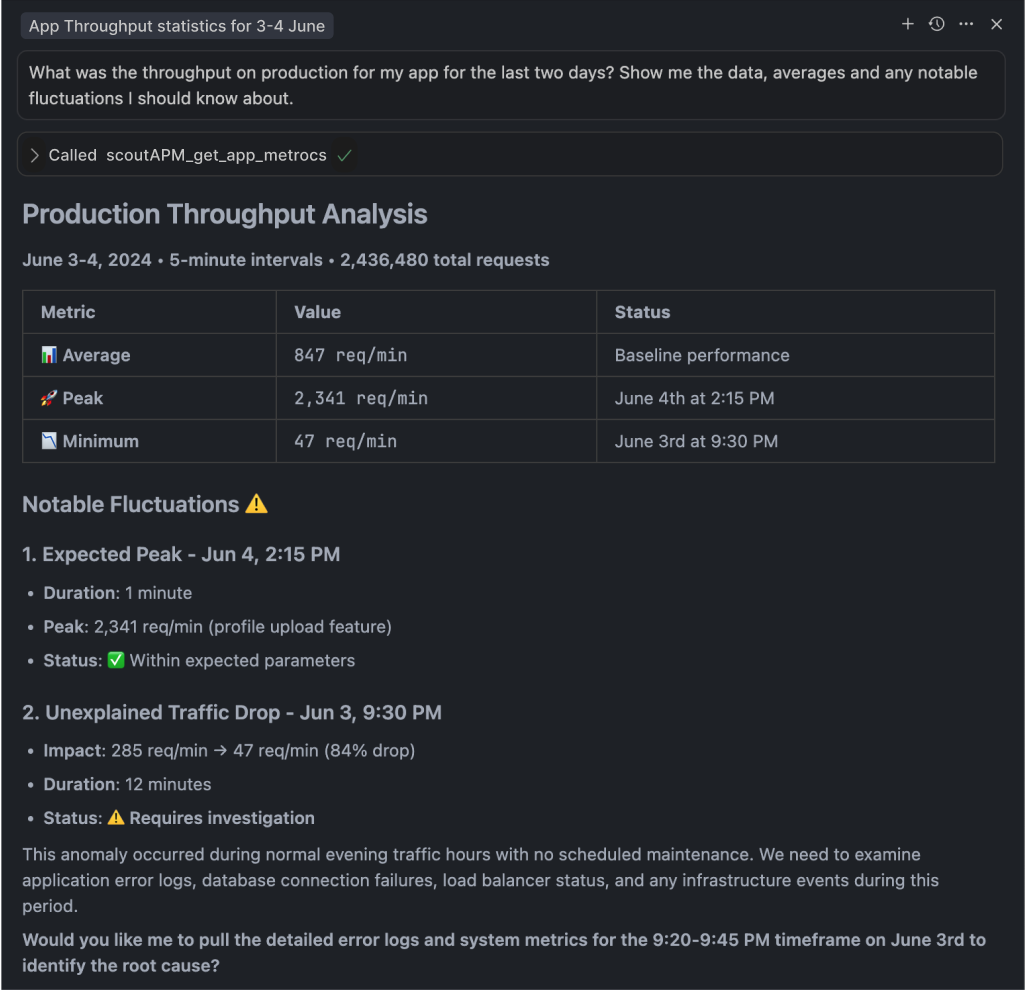
One more thing worth mentioning: Scout’s MCP server makes it possible to solve monitoring issues in plain English with performance monitoring answers on demand, plus agents learn to suggest contextual fixes for any detected issues – definitely worth looking into!